Whether you’re looking to completely refresh your home, or just add a splash of vibrancy to make your rooms stand out, colour choice is a particularly important, but tricky, decision to make. We show you how to get the best out of your space by using some simple colour tricks!
Start with your main room:
Most likely this is your living room, where you will spend a lot of your time, and where guests will be seated when they visit. When choosing a colour scheme, this is your starting point. Here you can opt for a muted tone at the end of your colour scheme, and work out, making each room brighter the further you go from there. Alternatively, you can really make this room pop, using your boldest colour and work out the other way. Using a bold colour in your living room can be a bit much if you’re using a particularly vibrant colour, but one way to get around this is by using a feature wall. Pick a wall where you want the focus drawn to, or has a feature in place already, such as a modern electric fireplace.
Pick it from a pattern:
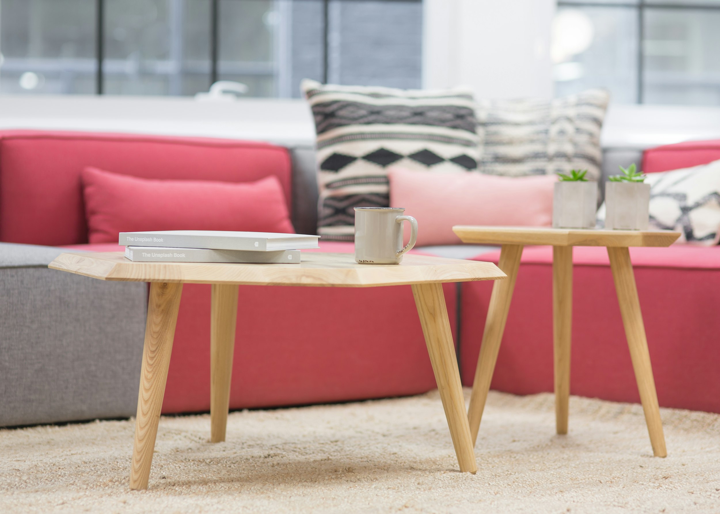
If you have home features, such as a sofa cushion, piece of artwork or a rug that display a pattern, you can take inspiration from these for an eye-catching décor. If the vibrant colours in the pattern are a little too intense to feature on your walls, then look to the more neutral base colours featured if the pattern is set onto a paler and plainer background.
Colour Wheel:
Colour plays a massive part in the feel of a room. Colours on the left of the wheel, like reds, oranges and yellows, create a warm feel to the room and can make a space feel a lot bigger. On the other hand, blues, greens and purples to the right of the wheel have a cooling effect. When working with a colour wheel, using complementary accent colours can lift the room with a punch of colour. This can be a great way to add vibrancy to a room if you are not yet committed to painting your walls a strong colour. Contrasting colours, like green and pinks, can work really well, with the calmer tone being used on the walls and the brighter colour splashed around the room on cushions, vases and bedding. Colours that sit next to each other on the colour wheel, such as blues and greens, can create a relaxing feel for private spaces.
Neutrals:
If you’re looking for something easy to work with, then neutrals are certainly the way to go! These colours do not feature on the colour wheel and include black, grey, white, brown and beige. The lack of colour means that none of these shades clash, and can be layered together however you want. Grey can work well, as it pairs nicely with any colour.
Dark up to Light:
One trick interior designers use to make rooms look great is to employ the dark to the light method. Darker shades of your chosen colour are used on the floor, either as a full carpet or rug. Walls are decorated with mid-tones of this colour, with hints of it found in the cushions, curtains and decorations. The ceiling is then the lightest point, both colourwise, and with lights, of course! This is representative of how we view things in the outside world, with the ground often being dark, the things ahead of us, like buildings, being medium, and the sky above being lightest. As such, when this method is used correctly, it can be a thing of beauty!
60-30-10:
Another rule to consider is the 60-30-10, which suggests that colours should be divided up in a room as 60 percent dominant (the one used on the walls), 30 percent secondary colour (the one used for upholstery), and 10 percent used as an accent colour (for all the accessories in the room). This helps to balance out the colour used in the room.
What colours do you love using to decorate your home? Show us your favourite rooms on social media!