Colour experts from the Pantone Colour Institute have made it an annual tradition to announce their choice of ‘Colour of the Year’. The past decade has seen an array of stunning colour choices, each of which have made a massive impact on the trends that the year will be remembered by. With 2018 just days away, we’re here to introduce the latest addition to colour of the year…
Before getting started on the most recent addition, we thought we’d give you a little summary of the historic colours of the year, starting from 2007, when Pantone’s ‘Colour of the Year’ first began.
2007 – Chilli Pepper – 19-1557
Chilli pepper is a fiery, passionate colour, empowering all who use it with a heightened sense of confidence and drive.
2008 – Blue Iris – 18-3943
The strong yet serene tones of Blue Iris paved the way for fashion, cosmetics and home products, offering stability in a time of uncertainty.
2009 – Mimosa – 14-0848
The vibrant yellow hue of Mimosa exudes the warmth of the sun, offering enlightenment and encouraging imagination and innovation to all who are naturally drawn to the colour.
2010 – Turquoise – 15-5519
The vivid, intense and calming qualities of Turquoise are known all over the world. With links to the tropical waters, this colour is seen to offer a ‘comforting escape’ from the stresses of daily life.
2011 – Honeysuckle – 18-2120
The pinky hues of Honeysuckle offered femininity paired with bold spirit for a powerful and brave shade to add to your daily life.
2012 – Tangerine Tango – 17-1463
Taken from the rich red and orange tones of the sunset, this colour exudes warmth, passion and energy for a firey start to the year.
2013 – Emerald – 17-5641
Emerald may have been once only a statement for jewellery, but in 2013, the world opened its eyes to the natural pleasures of this intense green’s elegance, sophistication and sheer luxury.
2014 – Radiant Orchid – 18-3224
The hint of mystery and magic in Radiant Orchid offer a playful and creative aura, emanating joy, love and health for all.
2015 – Marsala – 18-1438
The deep earthy tones and rich intensity of Marsala helps to enrich our minds, bodies and souls, especially when paired with other natural tones such as warm greens, blues and reds.
2016 – Rose Quartz – 13-1520 & Serenity – 15-3919
2016 was the first year where not one, but two colours were chosen to work in harmony together. The warmth of Rose Quartz balances against the coolness of Serenity to create a match for modern well being, and fulfilling the want for mindfulness.
2017 – Greenery – 15-0343
The natural radiance of Greenery uplifted the year of 2017, bringing an exciting taste of the tropics to the scene.
And that brings us into 2018, where the colour of the year is…
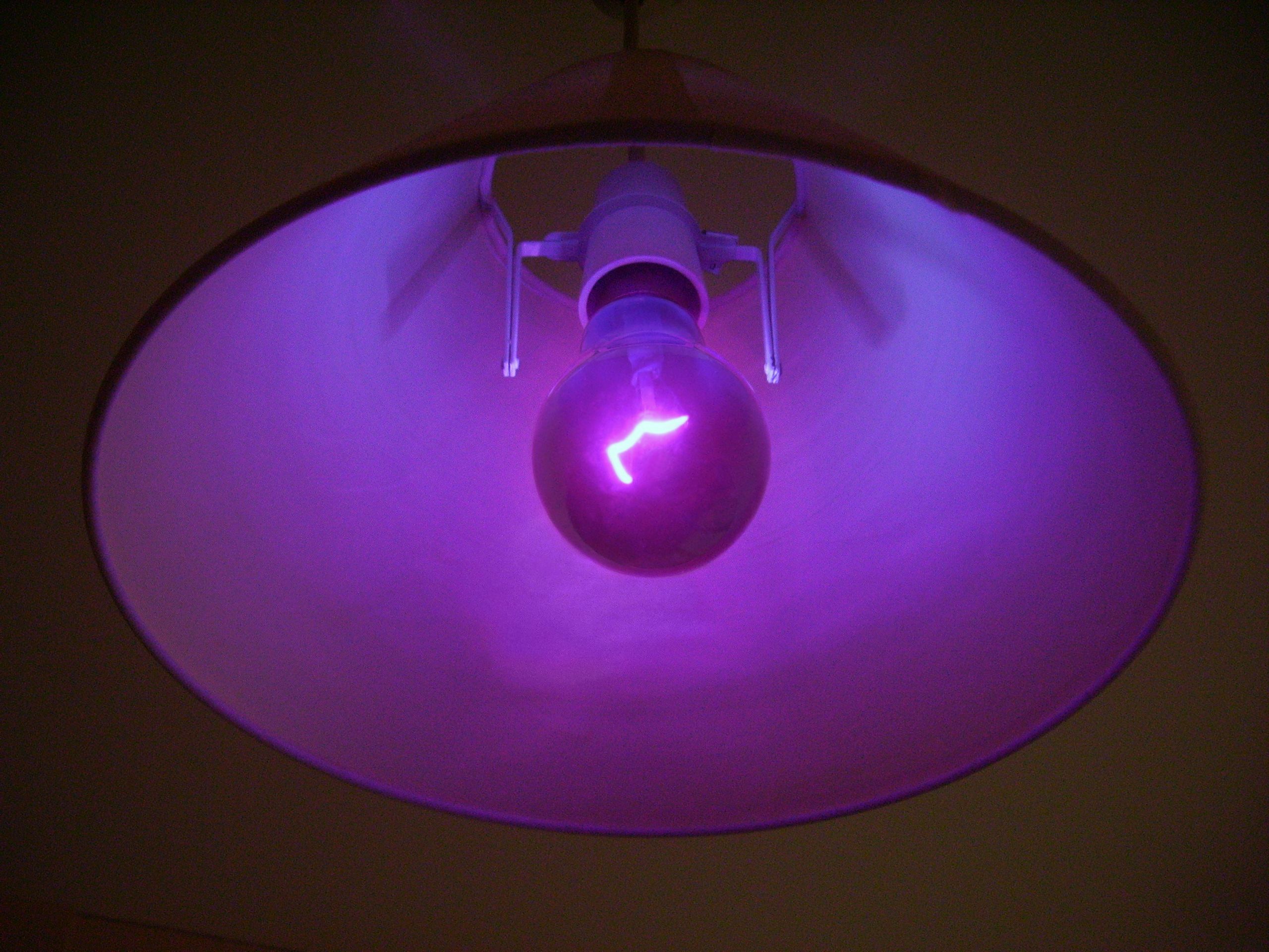
2018 - Ultra Violet – 18-3838
Pantone’s description of the colour is “A dramamtically provocative and throughtful purple shade, Pantone 18-3838 Ultra Violet communicates originality, ingenuity, and visionary thinking that point us towards the future.”
We can’t wait to see how this chosen colour will influence home, fashion and beauty trends in the New Year. Who knows, maybe we’ll bring out a special range of Ultra Violet gas fires to keep on trend!